The objective of assignment 5 is to produce a series of images that illustrate a story for a magazine, including a cover illustration and several pages inside. In previous posts, I’ve shown the planning and image selection stages of this assignment.
For this part of the assignment, I will show the images that I’ve selected and the captions intended to go with the images and then finally, show the images as part of pages for the magazine and how it would be organised. This will allow me to discuss how I see the images relating to each other and show there relative sizes.
Images
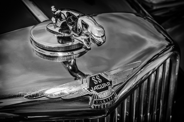
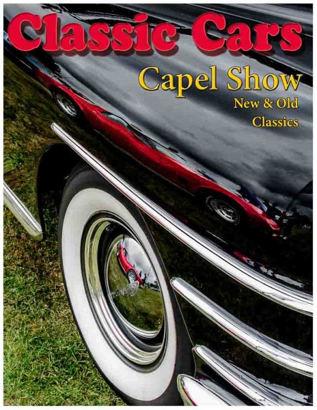
Illustration – Front Cover
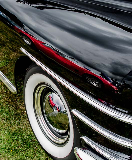
This image is using two symbols to illustrate the purpose of the magazine. The largest symbol is the classic black car with the silver trim and the white walled tires. This is something I feel is immediately recognisable as an old 1950’s style car even though we are only presented with a small amount of the car in the image.
Although this is the largest symbol, I don’t think it is the most predominant symbol of the image. This would be the two reflections of the red car. This is obviously a car from a different era and I feel the juxtaposition of these two cars together illustrates the show very well. In addition to the two cars, there is evidence of people in the image, a key part of the narrative I was hoping to achieve.
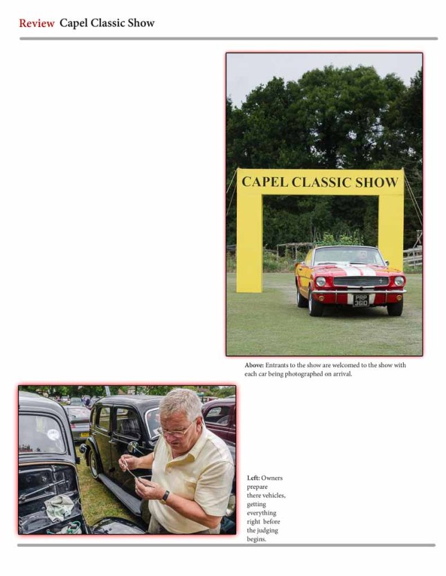
Welcome to the Show – Page 1
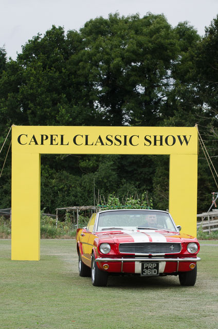
Entrants to the show are welcomed with each car being photographed on arrival.
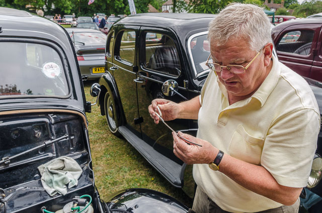
Owners prepare there vehicles, getting everything right before the judging begins.
Having the welcome arch as the first image of the series seemed like a great introduction. It clearly shows what the event is and has a car arriving. The colour of the car was intentionally chosen to relate back to the red car of the cover image.
As mentioned previously, including people in the narrative was an important aspect so I felt it was important to have a strong image of a person on the first page. This image shows a car owner preparing his car and there is colour relationships to both the other image on this page, through the yellows, and again back to the cover image with the black cars.
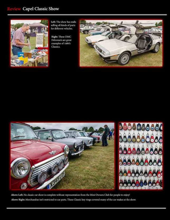
Things to see and do – Page 2
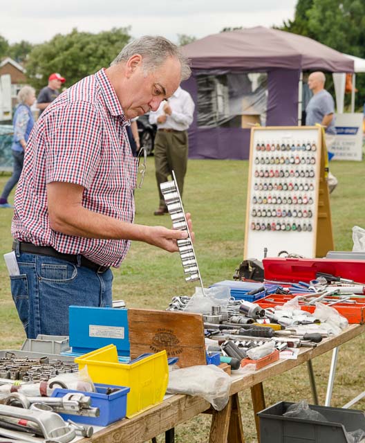
The show has stalls selling all kinds of parts for different vehicles.
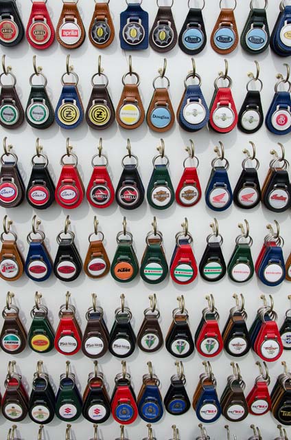
Merchandise isn’t restricted to car parts. These classic key rings covered many of the car makes at the show.
These two images are intended to work as a pair. The man looking at the car parts tells the story of how attendants to the show can do more than look at cars. In the background of this image, we can see the key rings which are then shown in detail.
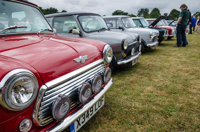
No classic car show is complete without representation for the Mini Owners Club for people to enjoy!
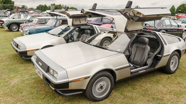
These DMC Delorean’s are great examples of 1980’s Classics.
With these two images, I wanted to introduce a bit more of the show and what is happening. The choice of cars is also intended to give a subtle message about the progression through time of car manufacturing. The cover photo was showing detail of a car from the 1950’s and a modern day car. Here, we have the mini which was introduced in the late 1950’s and has been popular since and then the Delorean’s which are a well known car from the 1980’s from the film ‘Back to the Future’.
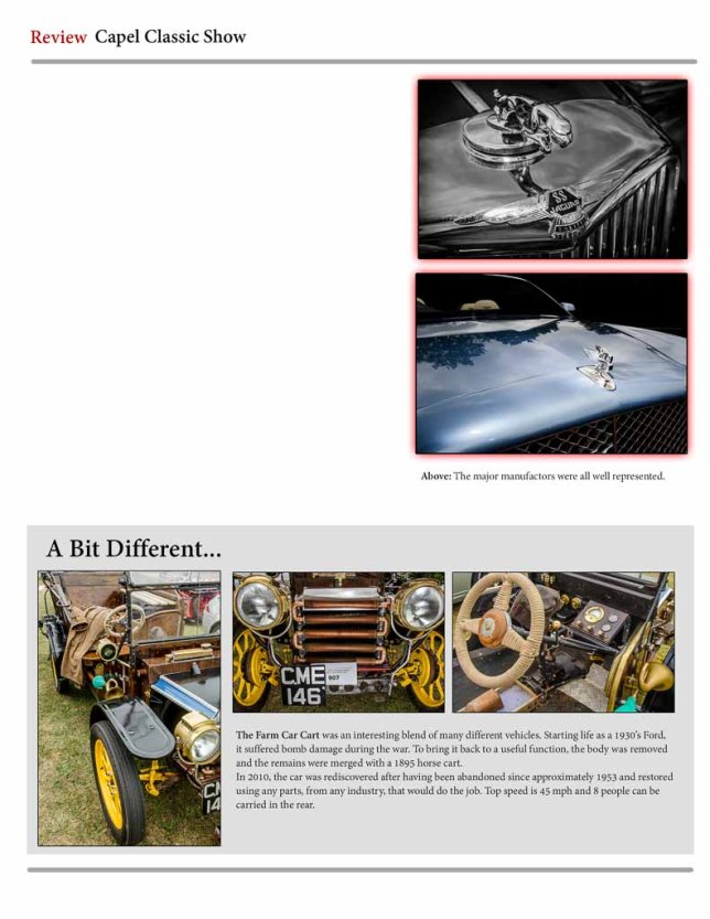
Small Details, new and old
 The major manufacturers were all represented.
Again, these two images are intended to be viewed as a pair using just a single caption. Having been given the context of the show with the images on the previous page, I wanted to focus in on some smaller detail. Using these two images, they show this detail but also show new vs old.
These three images continue, and go further, with the idea of showing and giving more details.
The bigger picture – Page 4
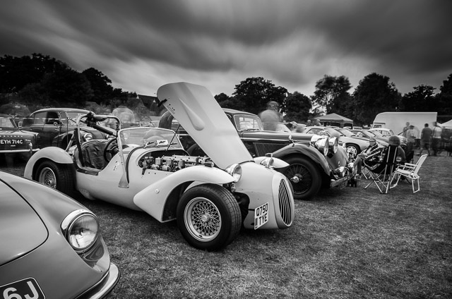
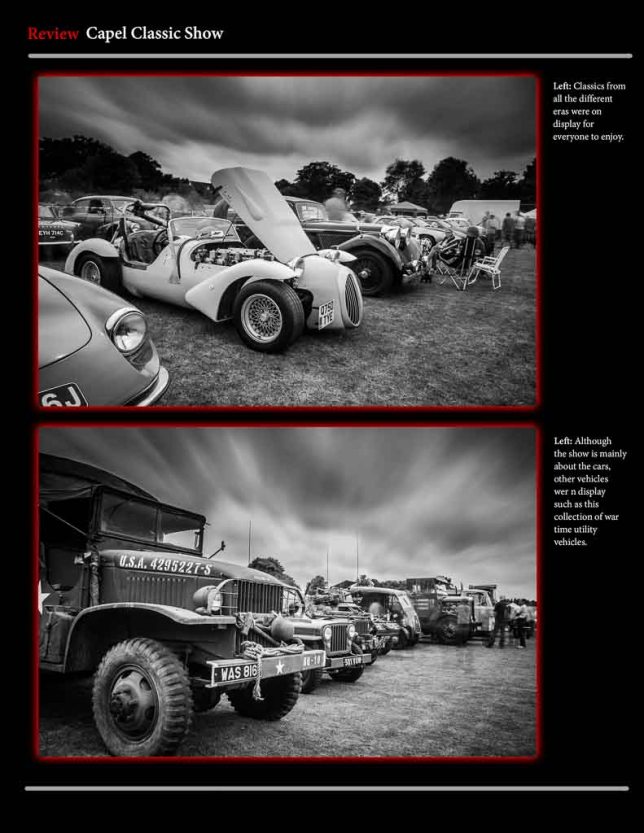
Classics from all the different eras were on display for everyone to enjoy.
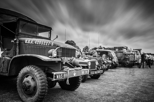
Although the show is mainly about the cars, other vehicles were on display such as this collection of war time utility vehicles.
This final page was intended to show the larger environment, maintain the narrative of peoples involvement in the show and also hint that there are additional things happening. The first image show more classic cars of different types and subtly includes people walking amongst them or having a get together. From the research I had done, I wanted to capture this kind of image which included people but I didn’t want the people to distract to much from the cars.
In the last image, a similar style has been used but vehicles, other than cars, are introduced. I deliberately left the introduction of other vehicles until the end of the narrative so that it brought the story of the car show to an end but also hinted that there could be more to see at the show.
Layout
The pages below show how I would take the images, organise them into there pages and show there relative sizes.
Front Page
Page 1
Page 2
Page 3
Page 4
Reflection
The first thing that comes to mind when reflecting on this assignment is that I approached a stranger and asked if I could photograph them whilst they were performing a task seemingly unrelated to me. Although this doesn’t really relate to the assignments objectives, to have done this, is something I’m quite proud of.
Throughout this course, I think my ability to plan and prepare for capturing images has improved and with this assignment it proved especially useful. Photographing at an event meant that I could not go back and capture that ‘critical moment’ because it would have gone. Also, at an event, there are photographic opportunities everywhere. Some obvious and some not so. The plan helped me stay focused on what it was I needed to capture to meet the objective. However, having too detailed or rigid a plan could be restrictive.
Having a plan wasn’t the only preparation that proved useful. Before going to the event, considering the types of images I wanted to take meant I had the correct equipment with me. As I had wanted to take long exposure images, I would have been stuck without a tripod, or if I hadn’t considered the fact that there could be strong contrasting light and busy back grounds I may not have taken my flash.
Coming home with a varied selection of images to choose from put me in a good position to be able to build the narrative I had imagined. However, putting it all together into the magazine format wasn’t easy. There were images that I had an emotional attachment to, because I liked the idea of the image or the image itself, but for some of them, they simply didn’t fit. I felt that I had enough images to be able to double the number of images I finally included but I think this would have defeated one of the goals of the assignment. Although the putting together the article wasn’t easy, it was still a fun and interesting exercise to carry out and I enjoyed thinking about how a larger number of images could be put together.
From this assignment, it has shown me that it takes practise to put everything together that I’ve covered on the course. As I progress, I can feel things becoming more instinctive. Using the idea’s from part 2, Elements of Design, is something that comes to me much easier now and is a great aid in trying to find an image. Also, I think I am much more aware of lighting scenario’s following part 4. Colour is something, however, that I think will need a lot more work. It seems like colour is a very complex area in the art of photography that could take a life time to master.